Wim Hoff Method App
Fall 2022
Timeline //
My Role //
Goals //
Constraints //
1 month
ui/ux designer
re-design the app to make it easier for new users to start the Cold Shower Challenge and upgrade to a paid subscription, to increase paid subscription conversions
small team of 2 designers
Context
Wim Hof, The Iceman
Renowned as an extreme athlete and motivator, Wim Hof popularized cold showers for stress reduction, stronger immunity, increased energy, and improved sleep. He developed the Wim Hof Method, a blend of breathing and mental techniques, enabling individuals to maintain their body and mind in a prime natural state. Using this, he achieved remarkable feats like ascending Mount Kilimanjaro in shorts, running a barefoot half marathon above the Arctic Circle, and enduring over 112 minutes covered in ice cubes.
Eventually, he and his team developed The Wim Hof app, where he imparts his knowledge to those that want to gain the health benefits of the Wim Hof Method and cold exposure.
App Usability Review
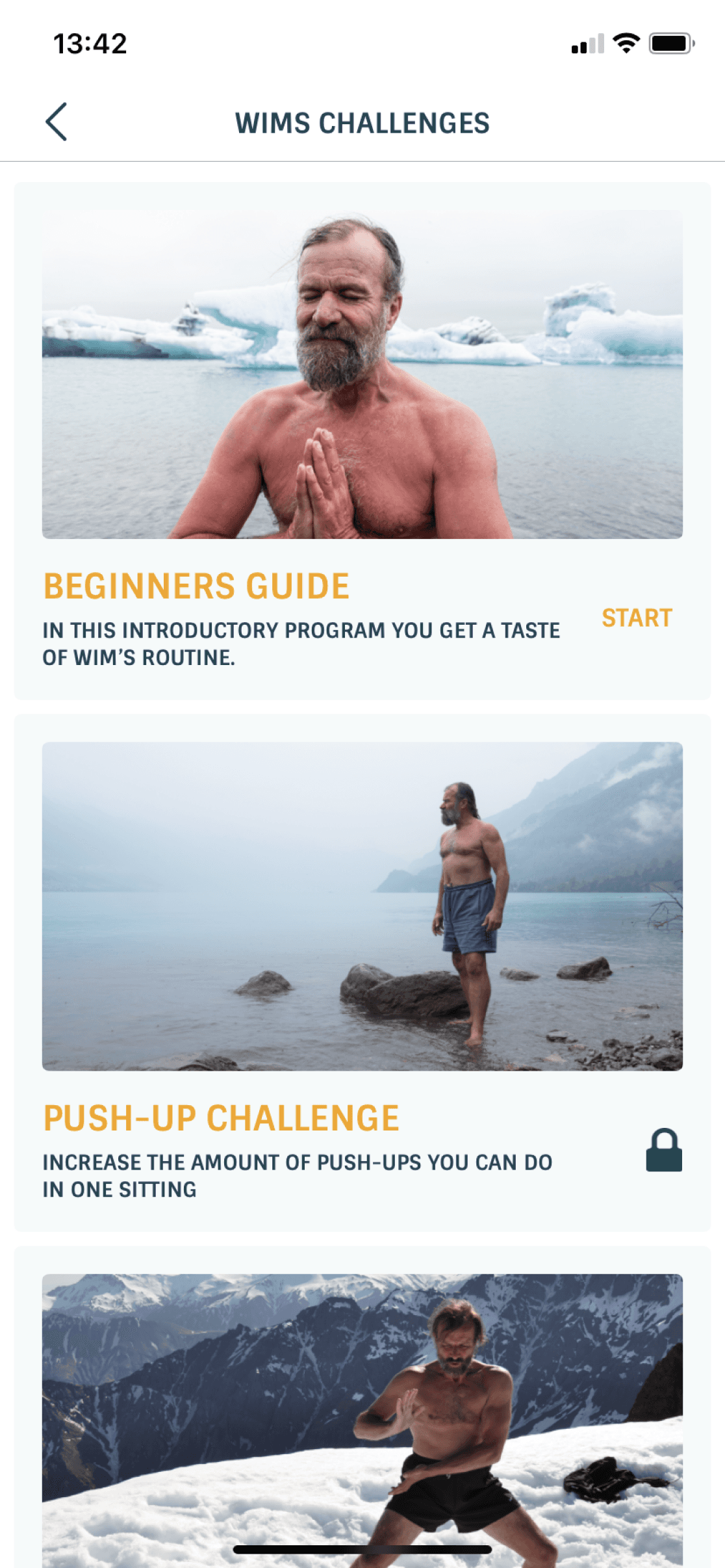
Cold showers are a core aspect of Wim Hof and his app, yet starting one is hard
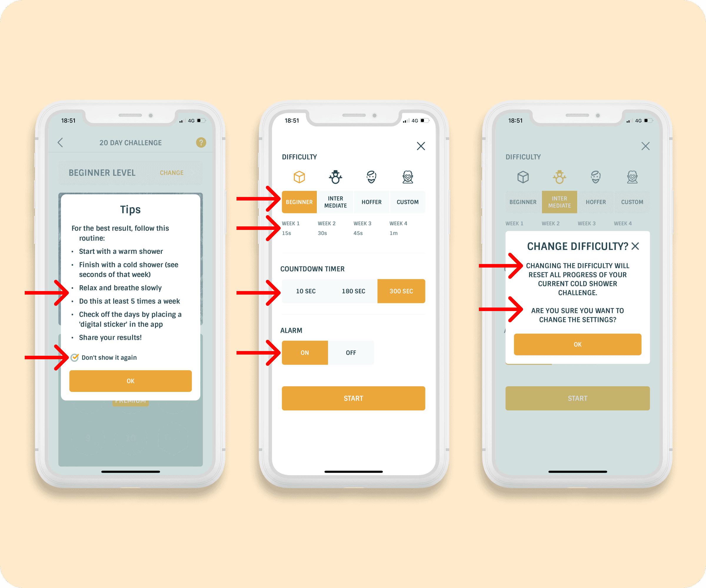
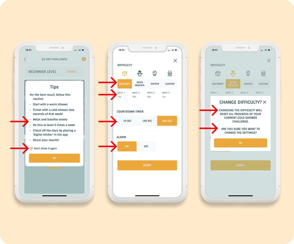
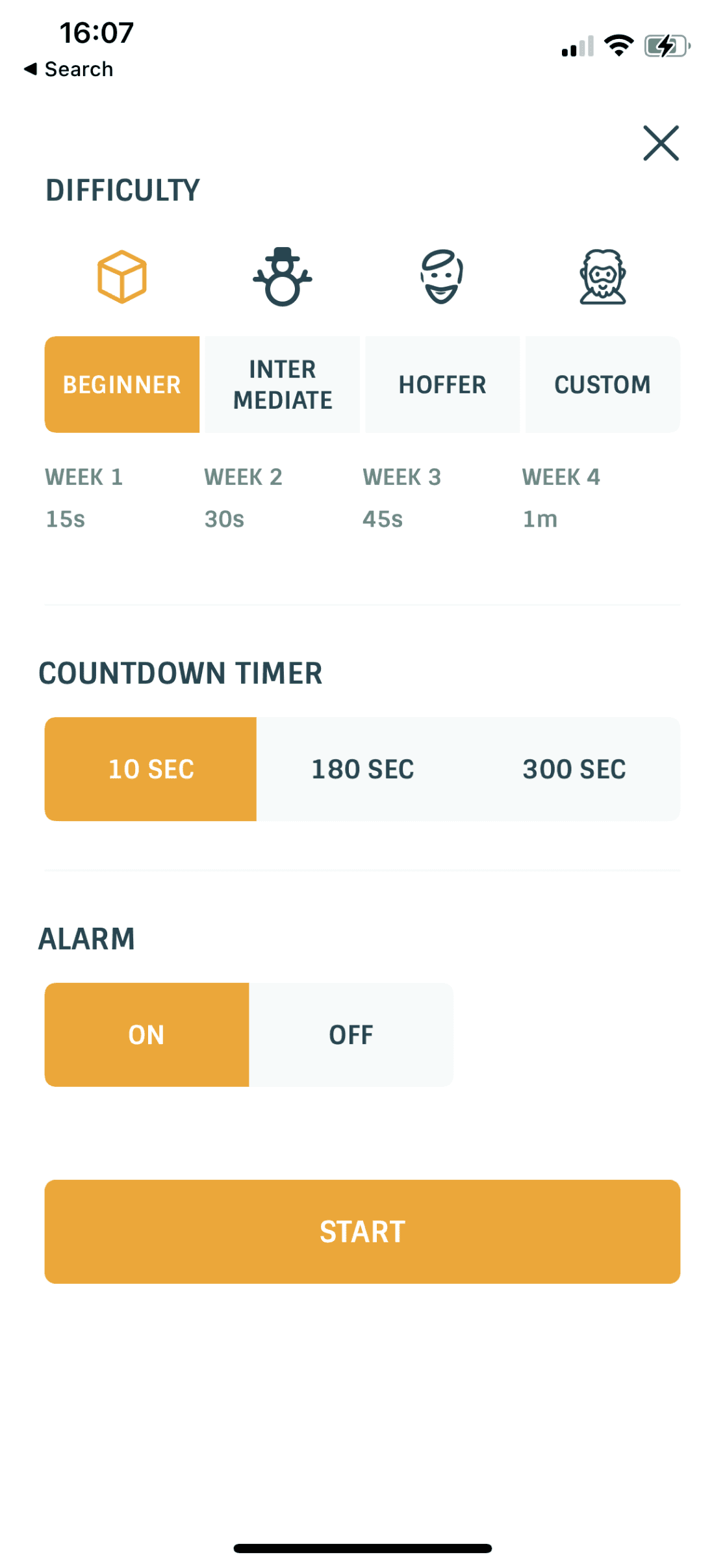
The app showcases an overwhelming amount of options and information for new users trying to start a cold shower, creating 'decision fatigue' for a seemingly easy task.
Weekly settings
3 difficulty settings + custom setting
Preset timers + custom timer
Countdown timers
Alarms
5+ bullet tips
Warnings
To start a cold shower, it takes at least 5-7 clicks
All these options and information are unnecessary for a rookie wanting to attempt a guided cold shower for the first time.
Moving forward, our goal is to make the first shower achievable in as few clicks as possible, to get them started on their new healthy habit while motivation is at its peak.
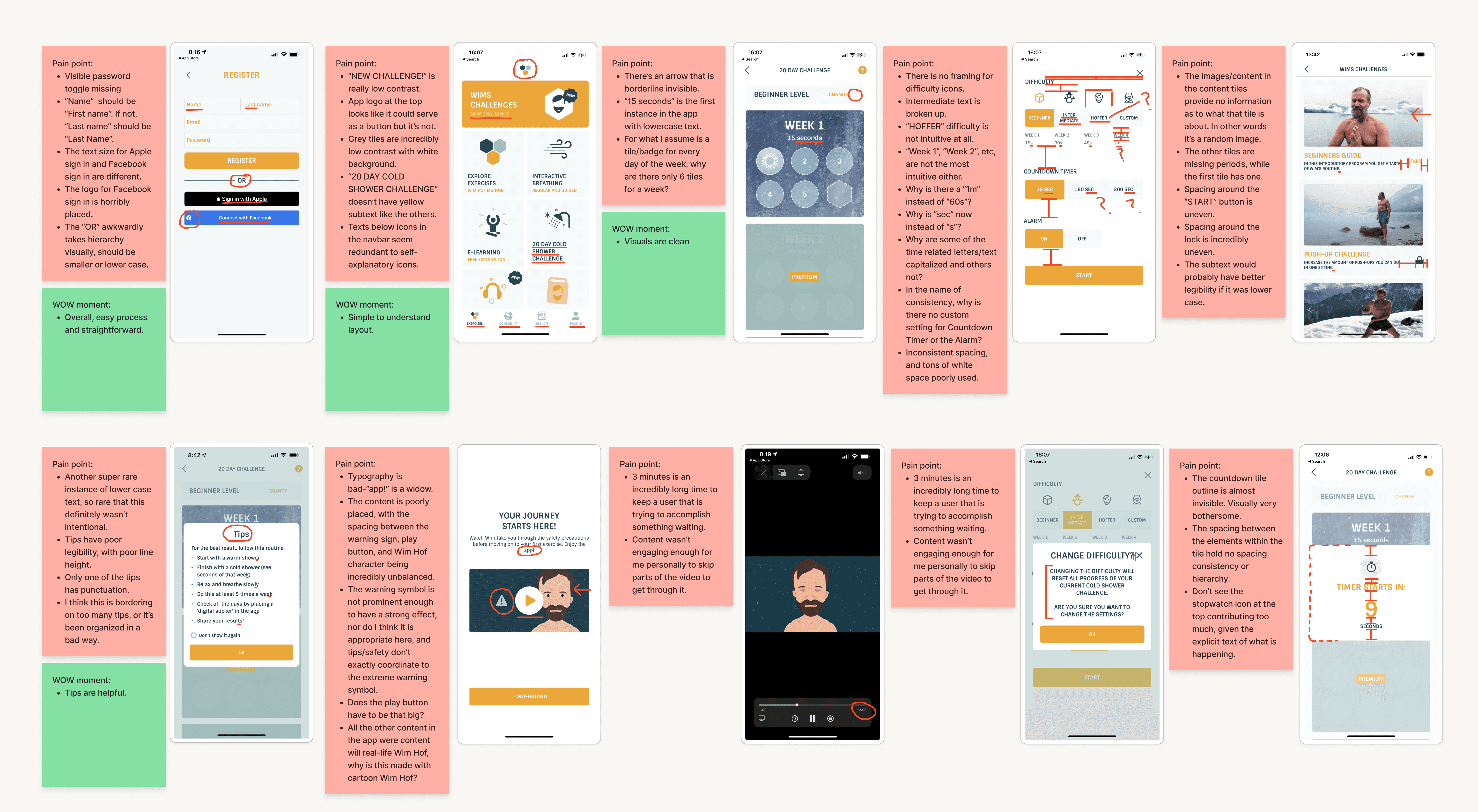
The app has inconsistent typography and design, with poor content organization
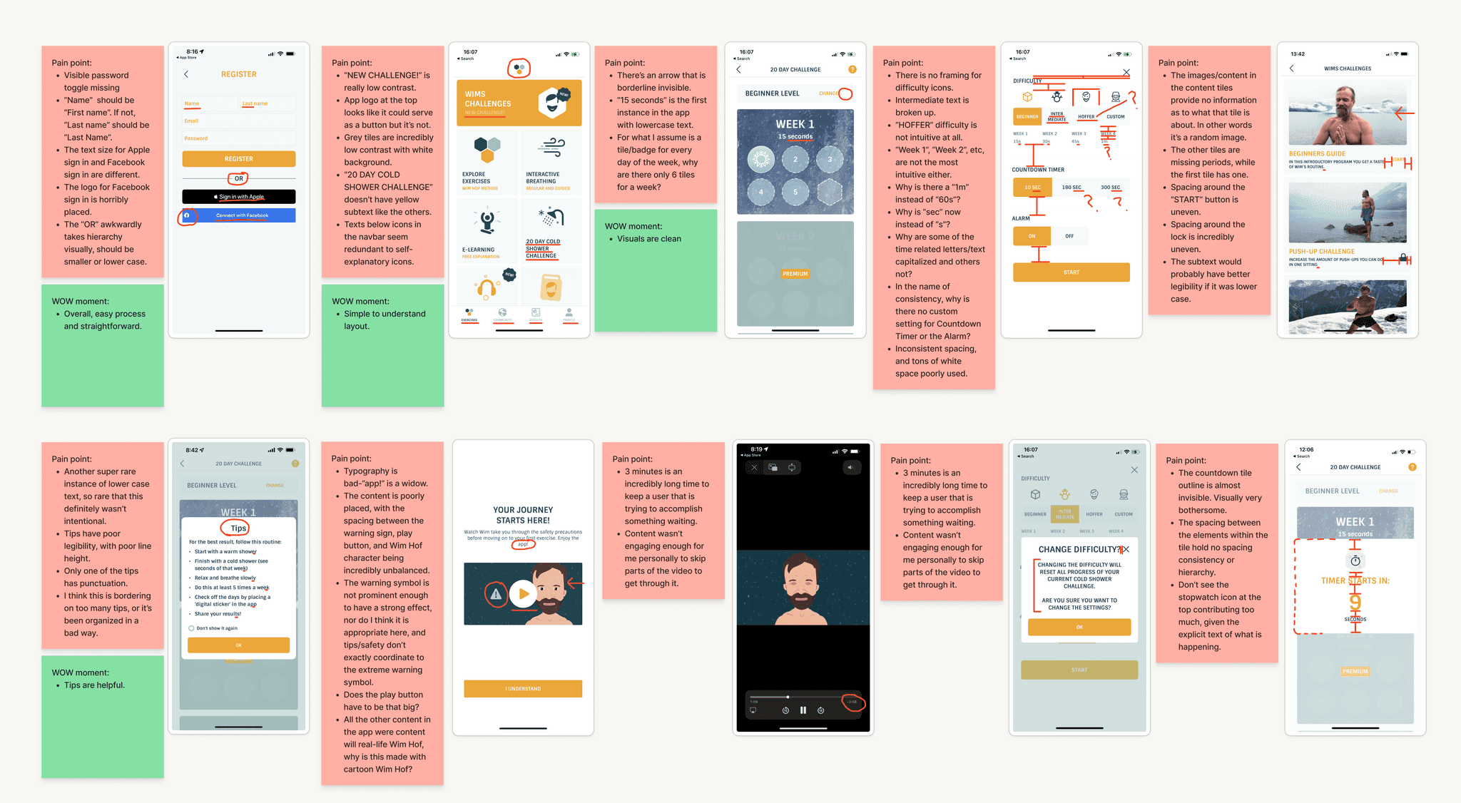
Combining user and design pain points into red sticky notes and positive elements in green sticky notes, there was a lot to be desired.
Competitor Benchmarking
Cold Water Therapy, a direct competitor, turned out to be incredibly mediocre
Poor spacing consistency and general design like WHM.
Exudes an almost 'clinical minimalism' that is painfully sterile of any character or warmth in wanting to interact with the app.
A strong positive is that it is simple and straightforward to use.
But Breathwork, an indirect competitor, greatly inspired us in improving motivation in users
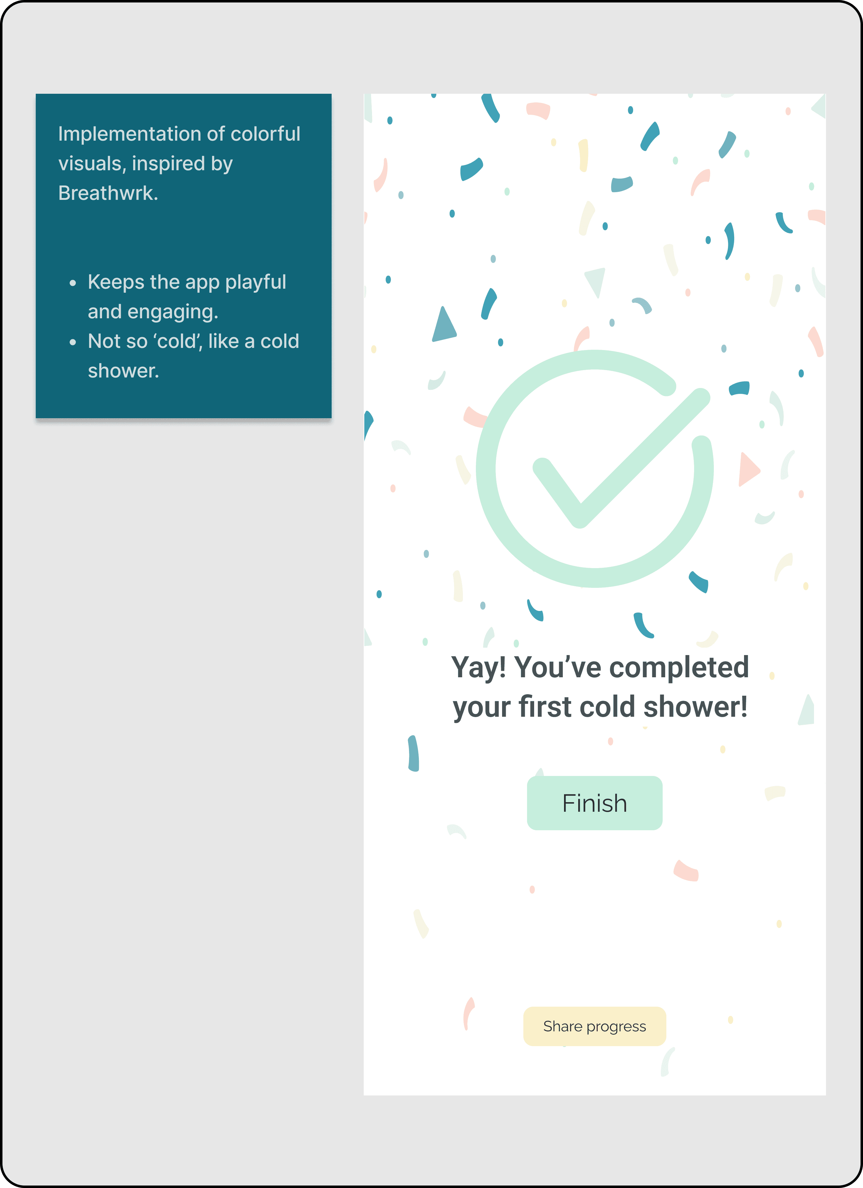
The app is colorful and exciting to use copmared to WHM's overly simplistic color scheme.
Cool animations that make you forget that you are waiting.
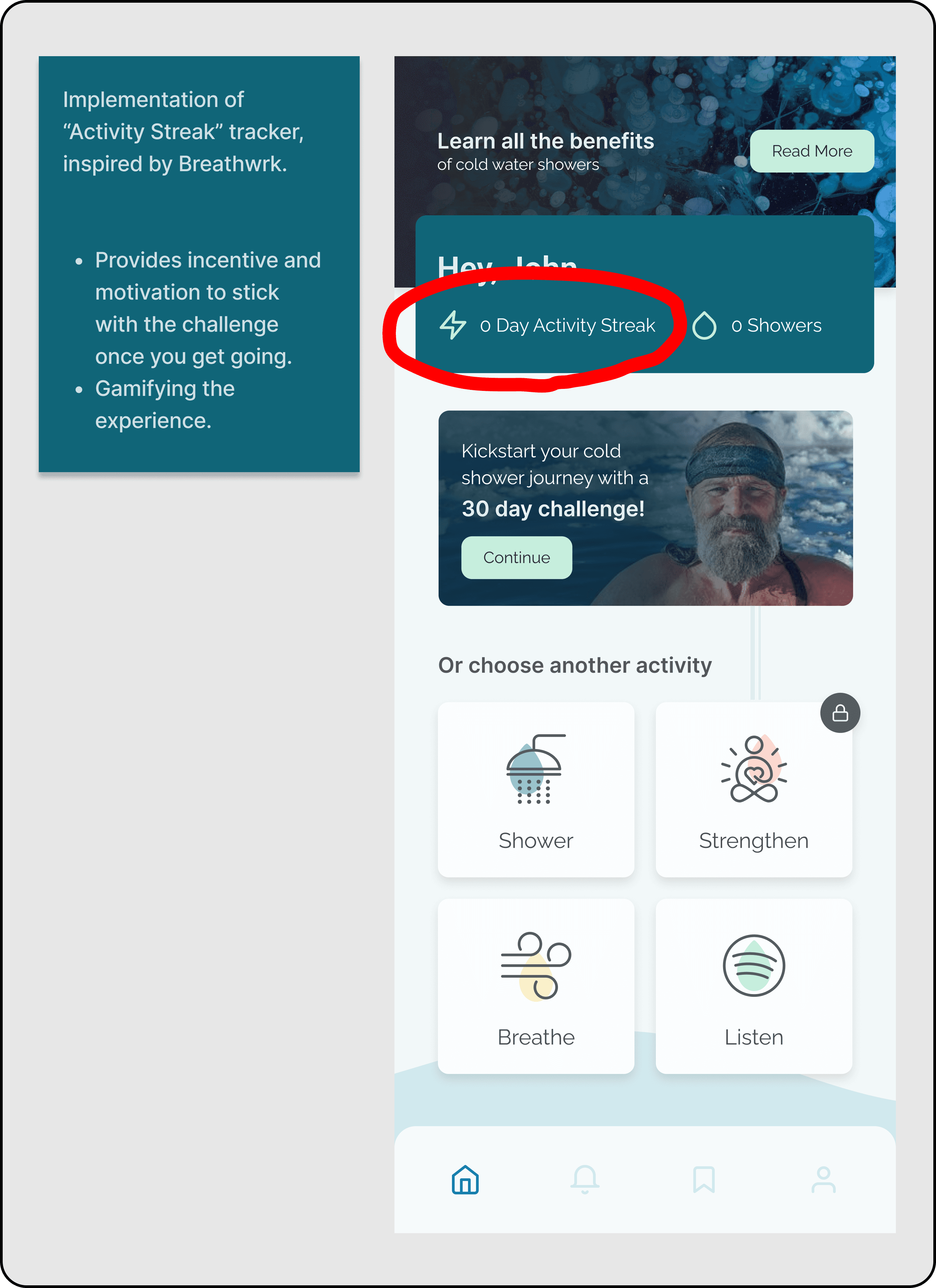
A plethora of viewable stats that help certain users greater appreciate consistency in their performance.
Ideation
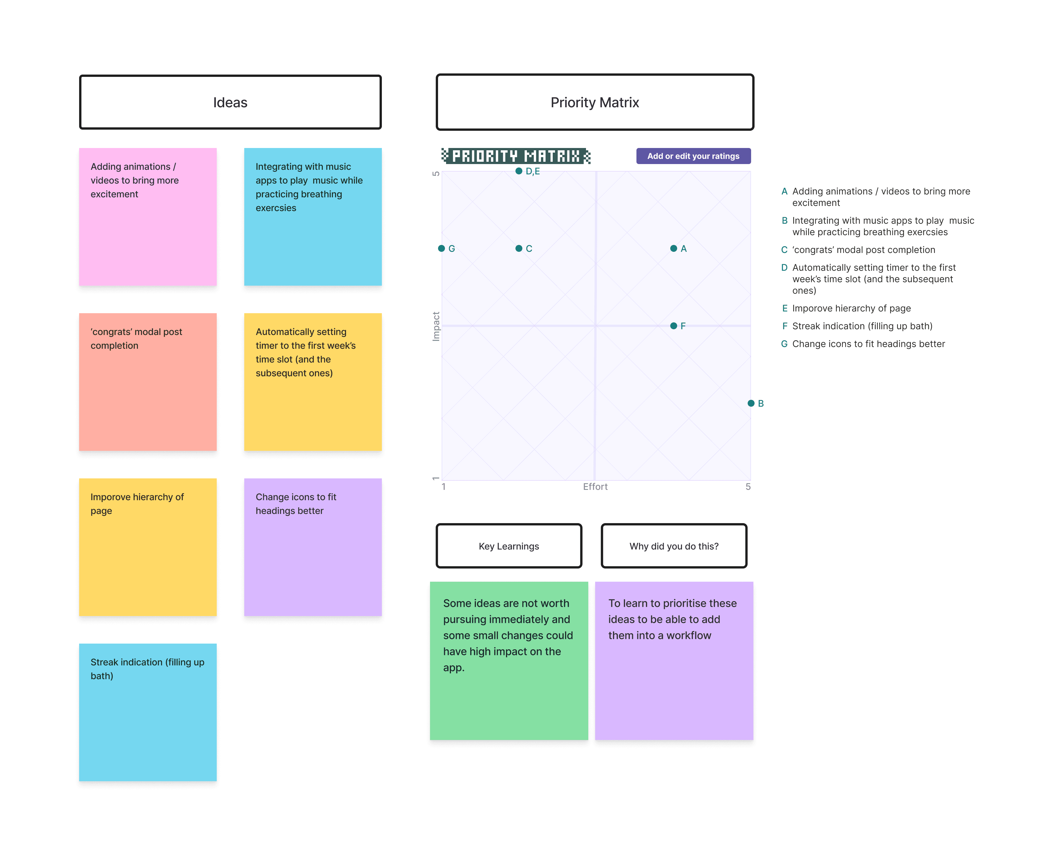
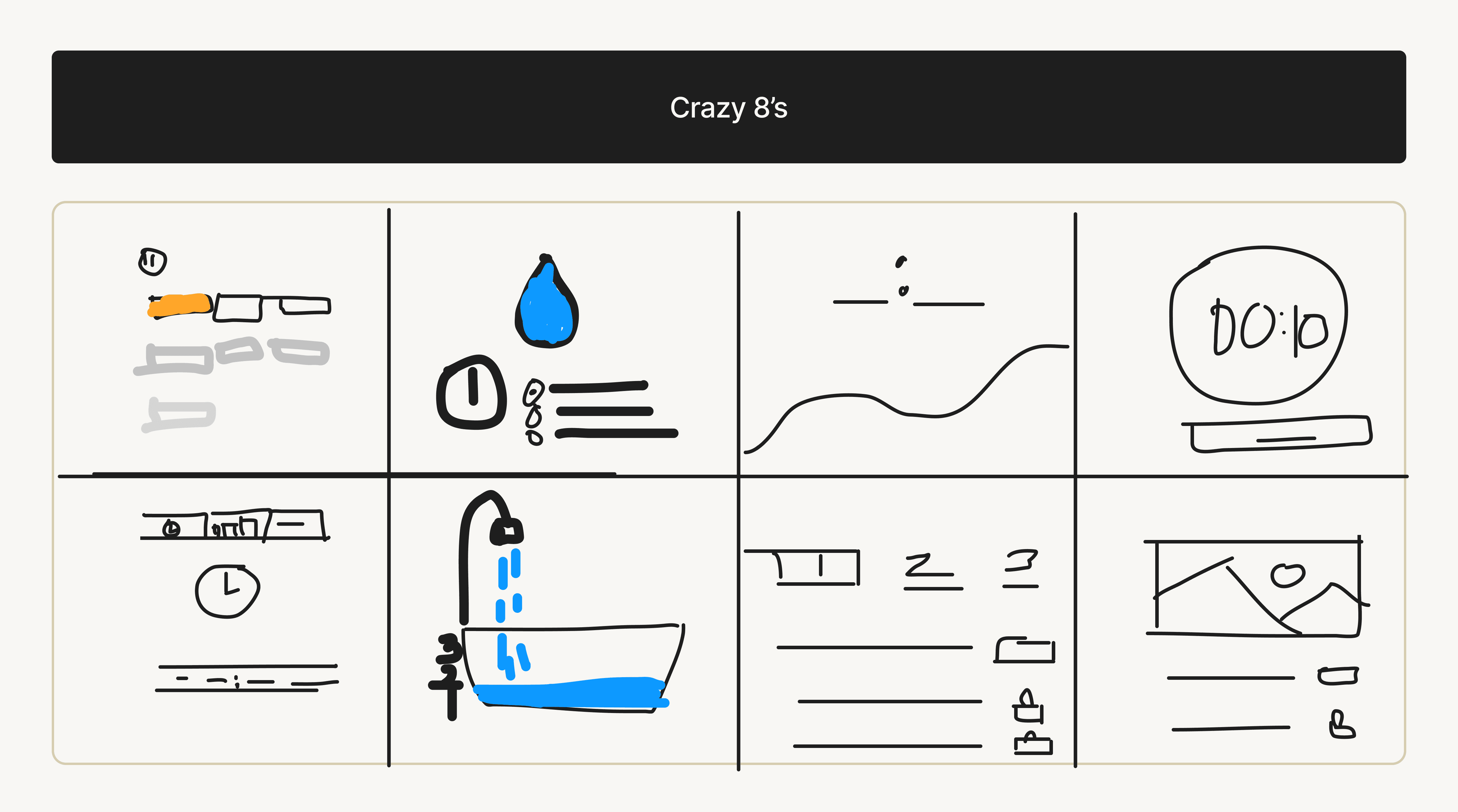
Conducted 'Crazy 8's' to rapidly generate ideas
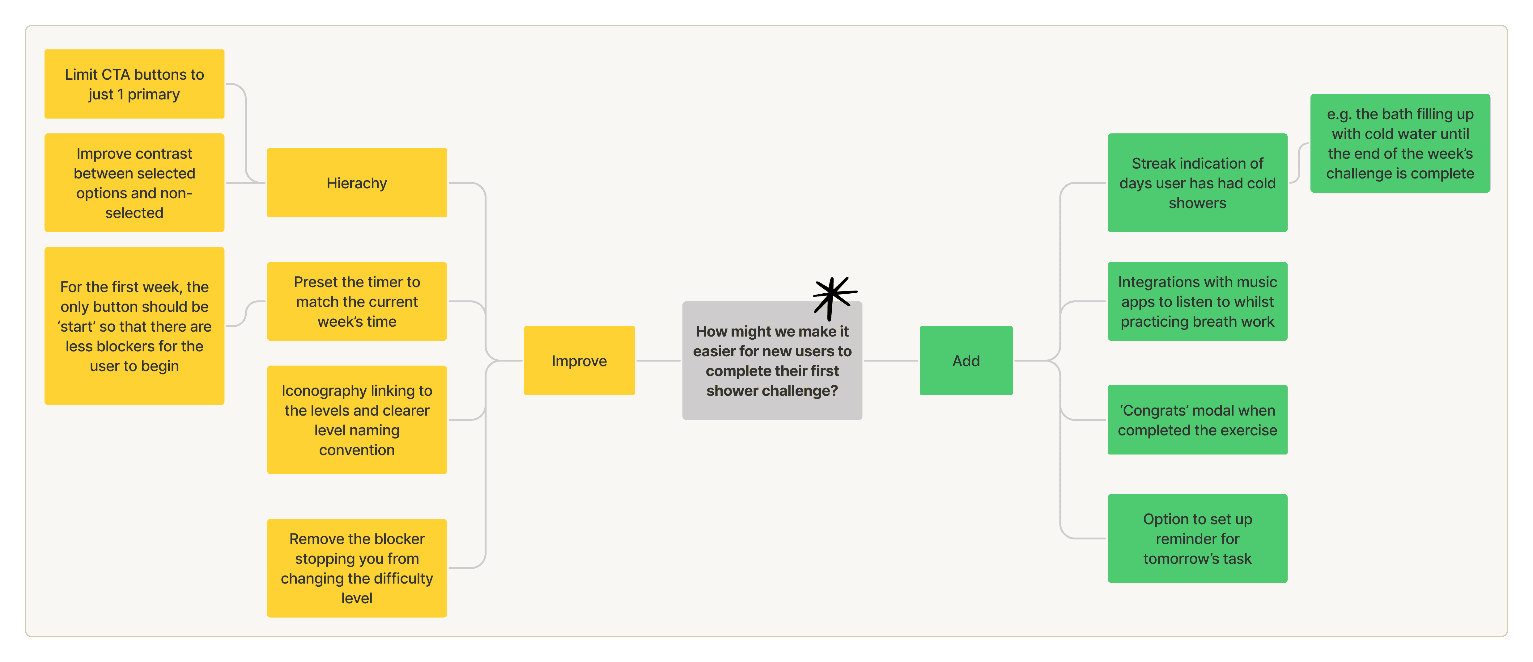
We created a 'Mind Map' to map opportunities in improving existing app features and new opportunities with new ideas.
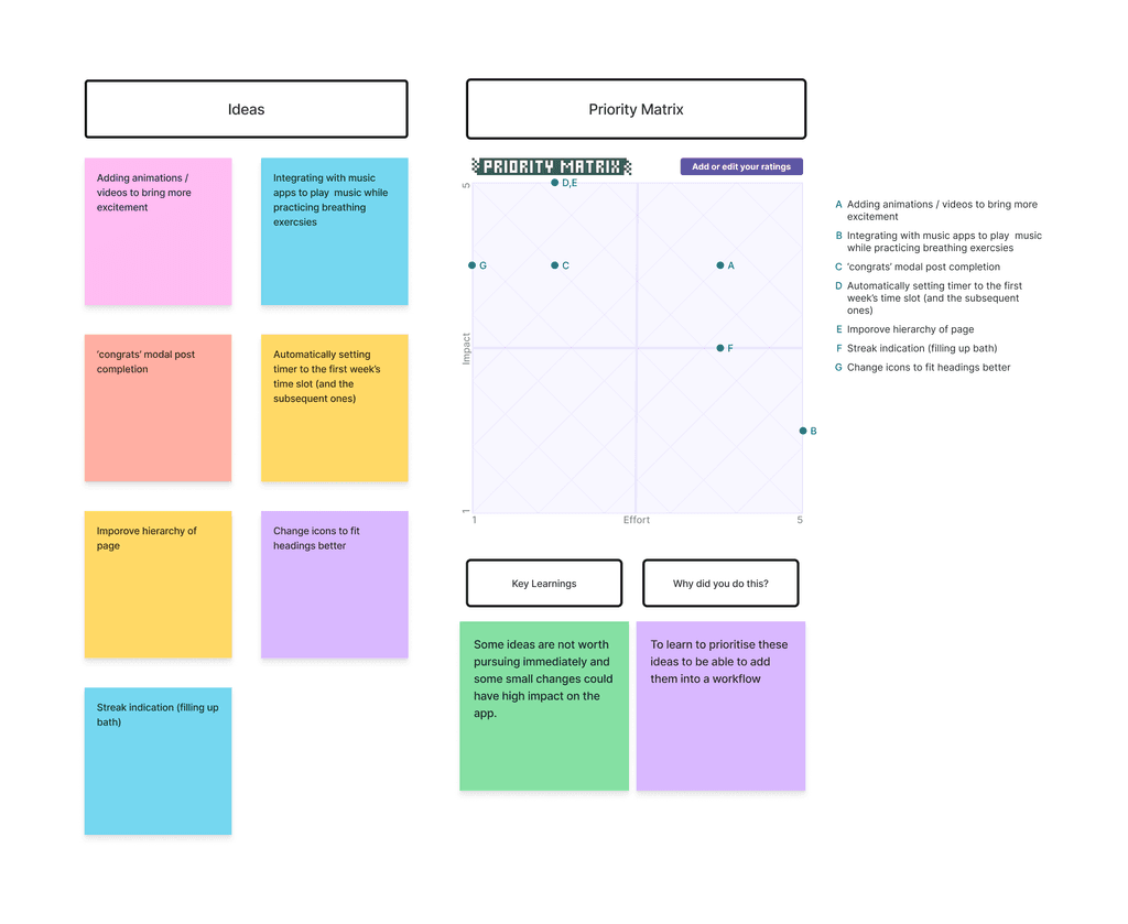
Ranked our ideas using a 'Priority Matrix' to determine the high-impact, low-cost ideas
User Flow
We created a new User Flow with a focus on an approachable user experience
Learning from the current User Flow's limitations and our aim for a smoother user experience for new users, we redesigned the User Flow prioritizing compartmentalization to ensure a simple, digestible process.
Original User Flow
Improved User Flow
We segmented the Improved User Flow into 4 sections;
Login
Select Challenge
Complete Challenge
Set reminders
And created the Improved User Journey through the lens of wanting to provide the easiest experience possible.
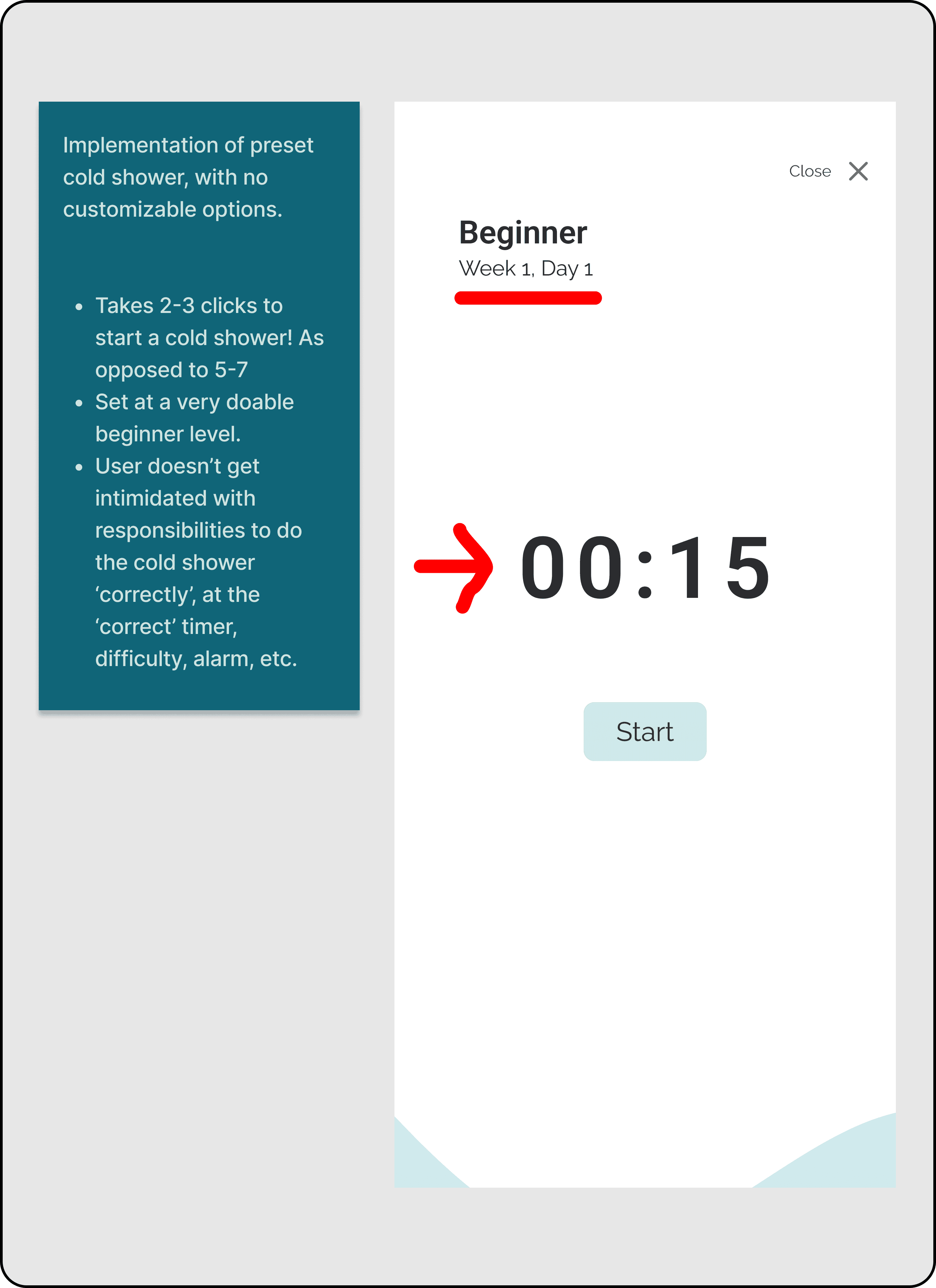
This meant removing customizing functions until after the first couple showers, and pushing functions like 'setting reminders' till after the shower is done.
By removing the ability to customize, we also alleviated the responsibility of having to do a cold shower 'correctly', with the 'correct' difficulty, time, and alarm set.
Wireframe
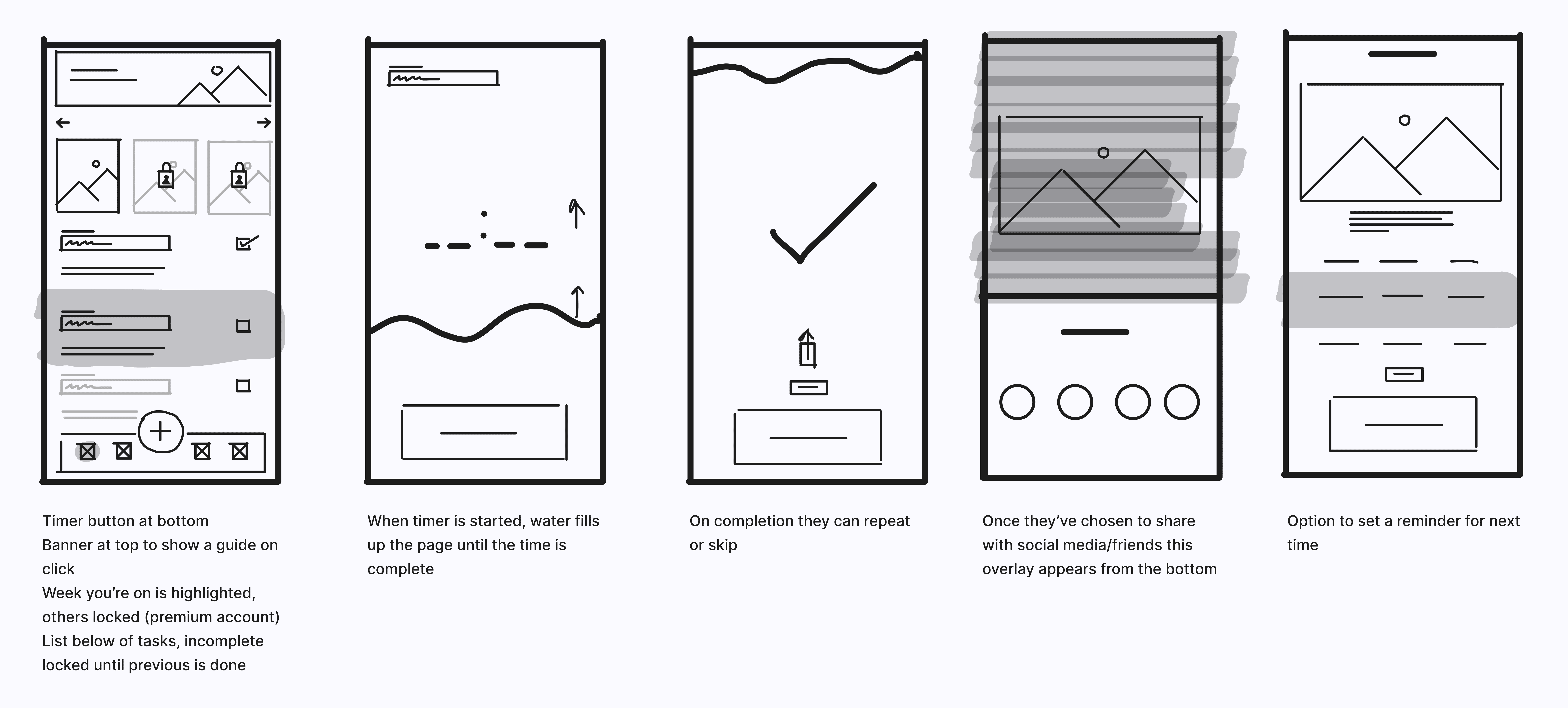
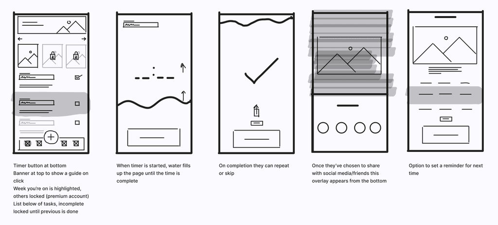
Simple, low-fidelity wireframe that incorporates our ideas into our improved user-flow
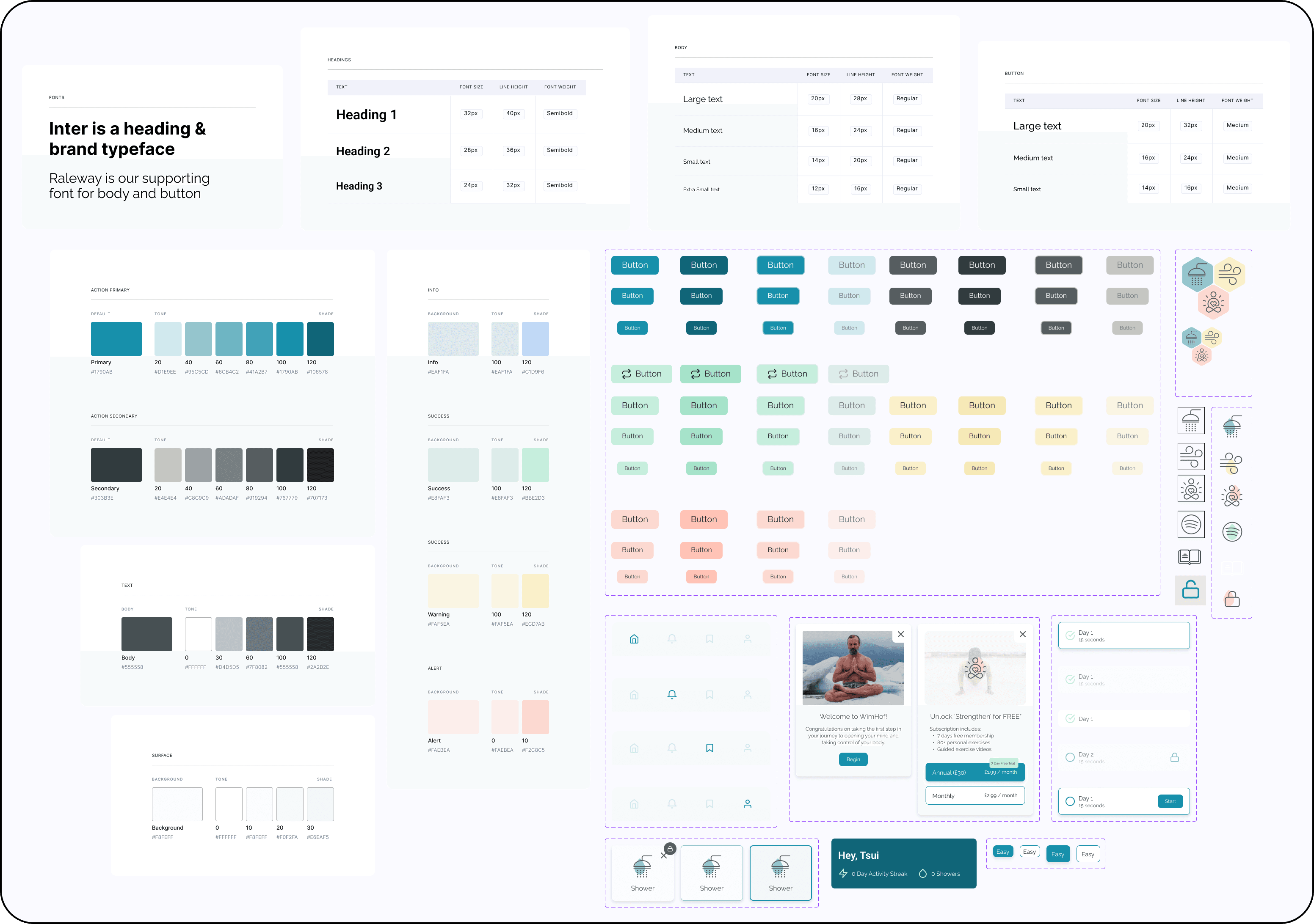
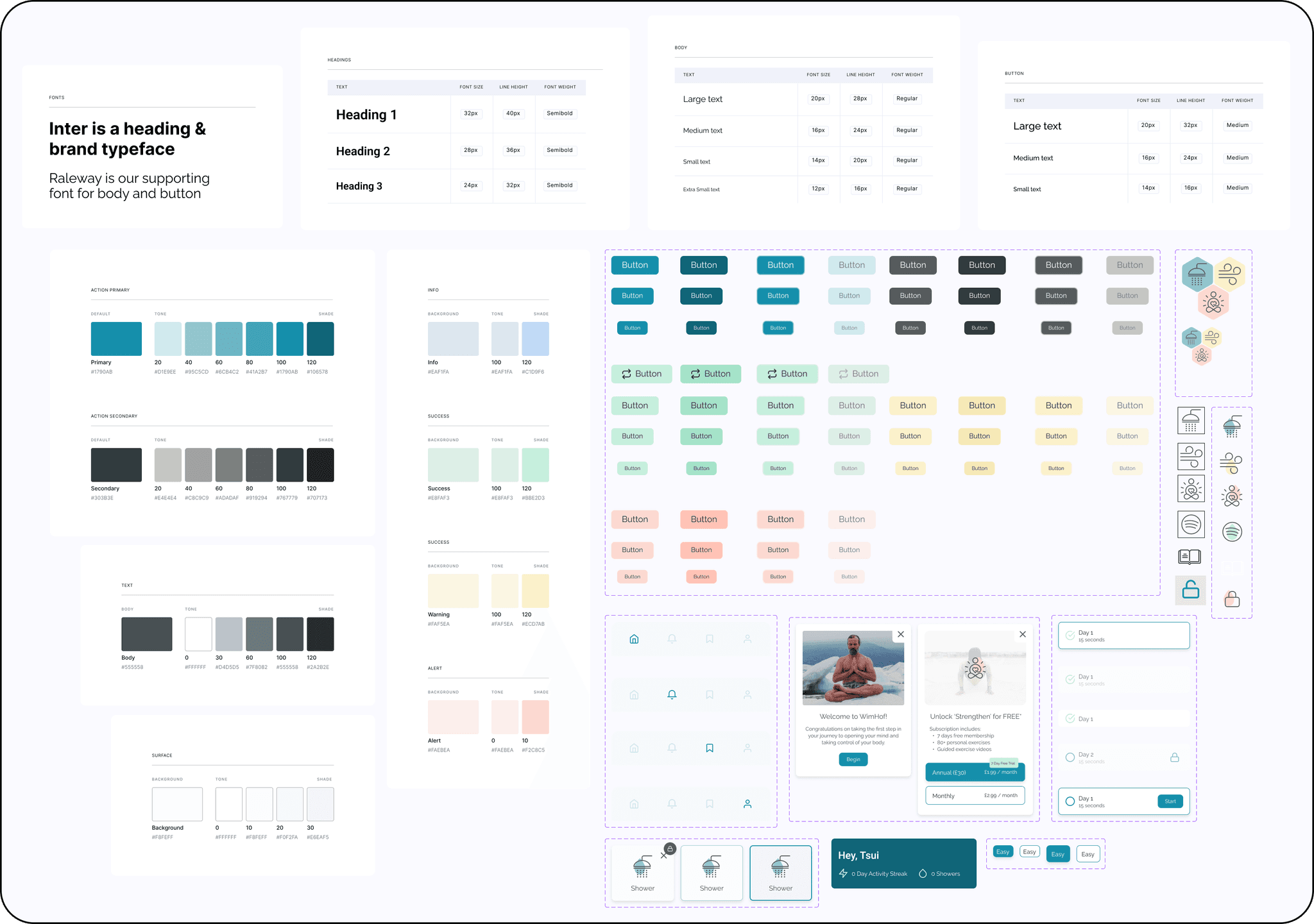
Style and Components
We changed the colors to blue, cause ice is blue, and ice is cold, and Wim Hof is all about cold
The existing yellow color-scheme seemed like it lacked intention/purpose.
Blue was the obvious choice to us, due to Wim Hof and his heavy branding around cold, and his feats in ice/snow.
We tried, but couldn't rationalize keeping yellow as the primary color.
Prototype
Your first cold shower is now only 2 clicks away
Starting a cold shower is now almost 4x easier.
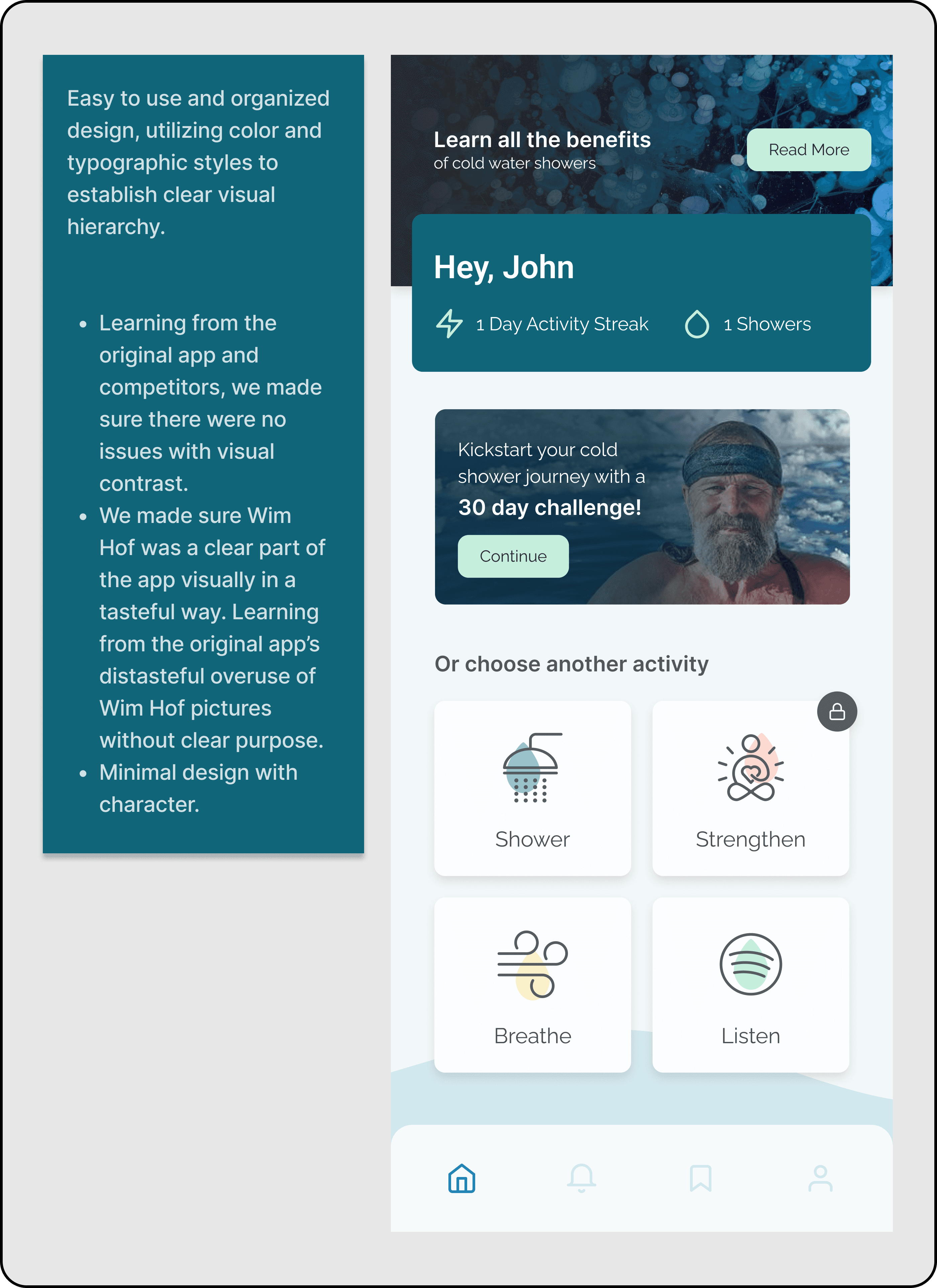
The app now has typographic/visual consistency and hierarchy.
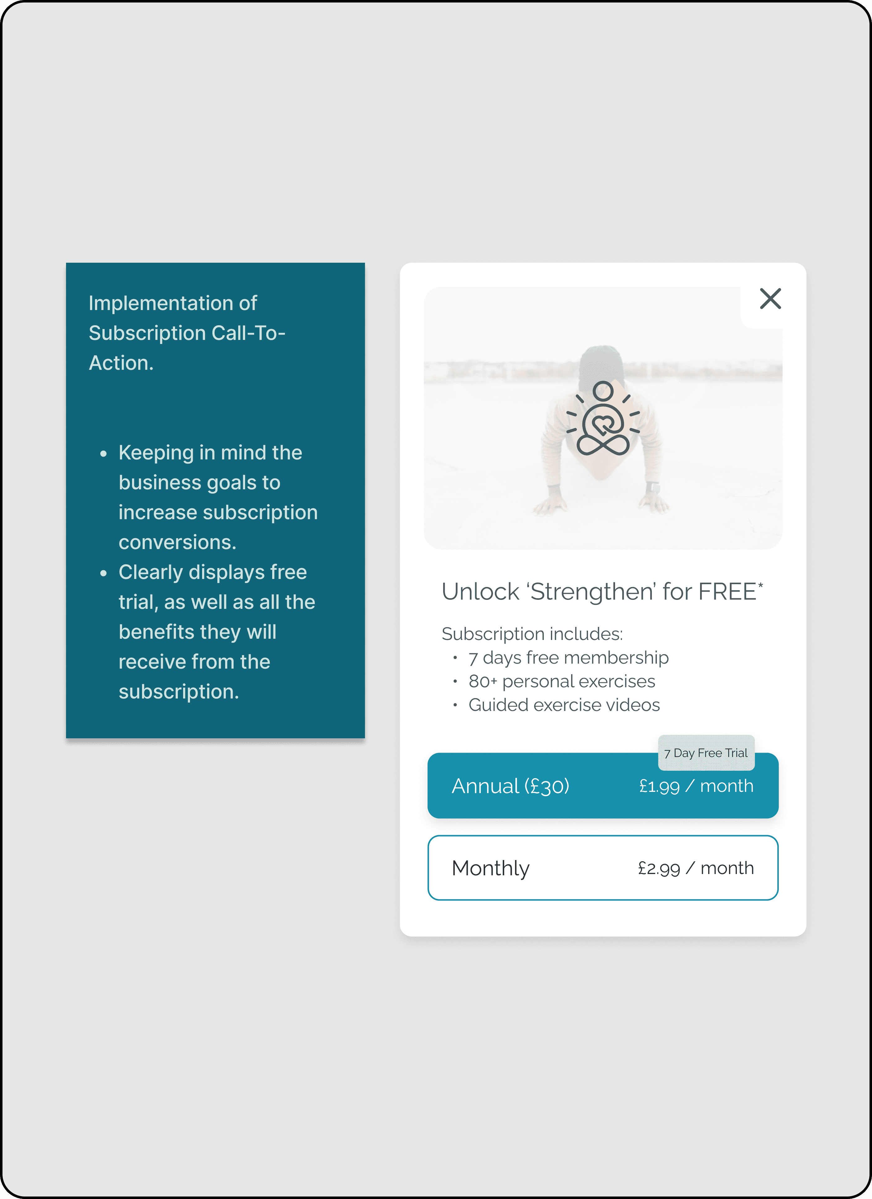
Features/Call-To-Actions for Paid Subscriptions are implemented in a a tasteful way, after they've experienced what the app has to offer.
User Research // Usability Testing
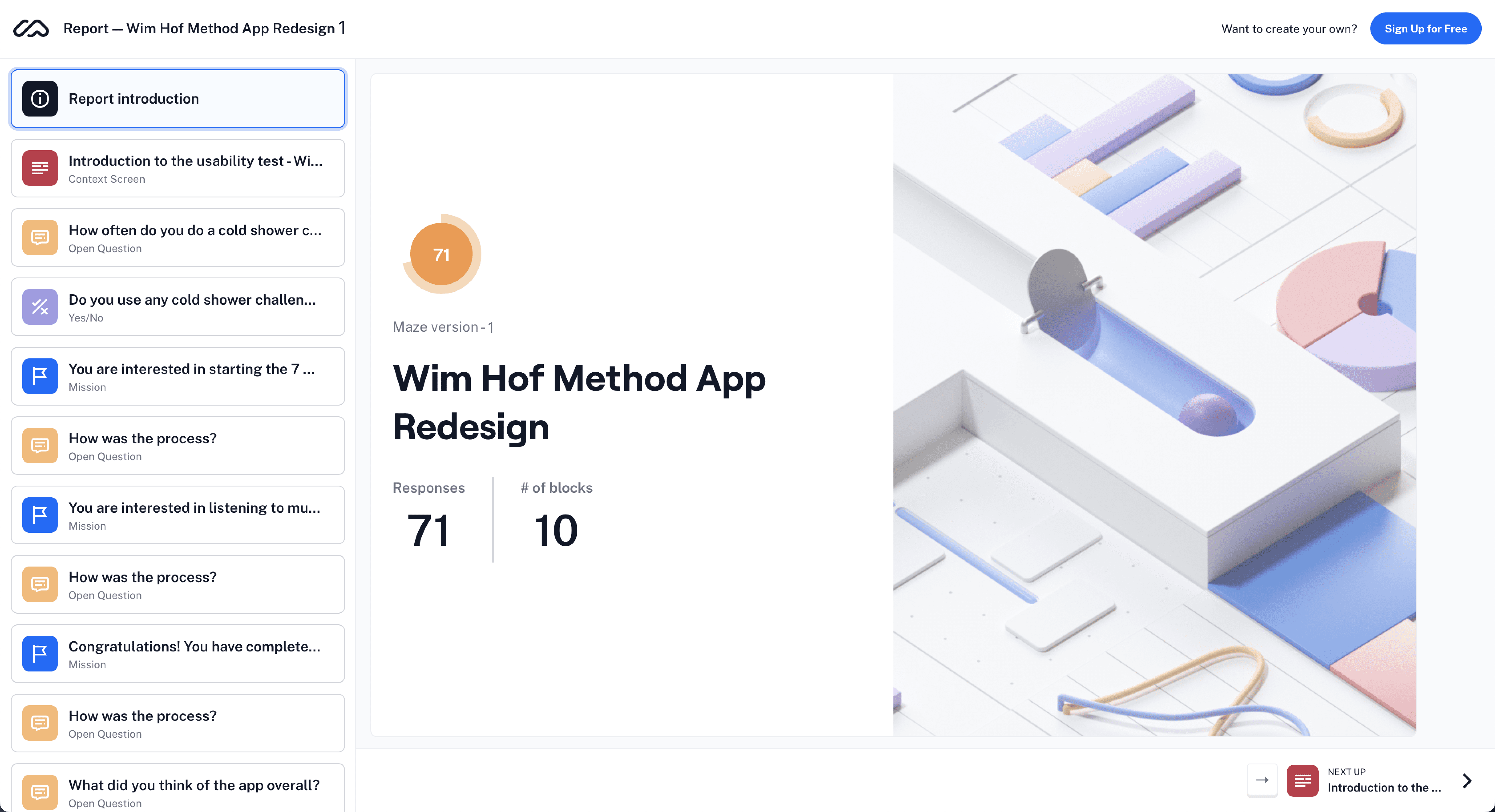
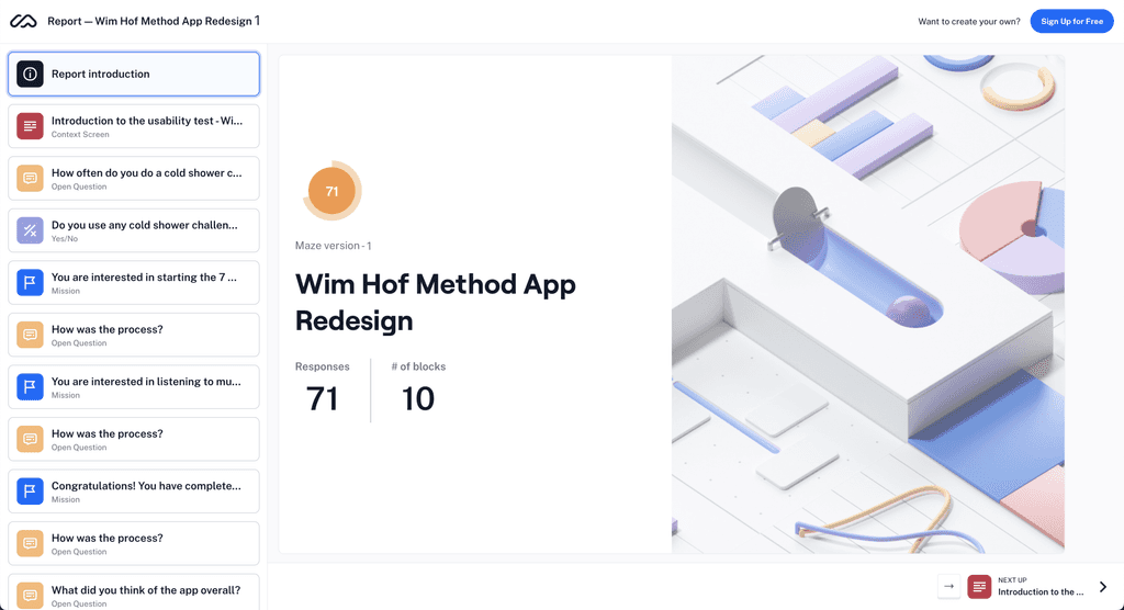
Using Maze, we learned from our users that our redesign goals were met!
Users reported that starting and finishing a shower was "really" easy.
Overall, app maneuverability was good due to simple UI.
10 blocks is lower than we anticipated, and we believe we know where we can improve this number to be even lower.
Results
Overall a success, with things to refine
A tester questioned why we inquire about goals during signup when all four goals, regardless of selection, appear on the home screen.
Initially intended to be a way for us to tailor the user experience, we now see it as an unnecessary signup step since the Wim Hof Method ties all four 'goals' together.
Furthermore, constrained by our small team and limited time, we couldn't thoroughly test other app features. Our main focus was making the initial cold shower an easily achievable task for new users.
What I Would Do Differently
If I could do this all over again…
…I would want more time pr a bigger team so that I can…
…conduct user interviews before designing.
…get user feedback on early prototypes.
…execute the ideas that were left behind for the sake of time.
…explore improving the other app features, like meditation.
